Navigation button not responsive on phone

Home Forums Criss Cross Skin Navigation button not responsive on phone

This topic contains 3 replies, has 2 voices, and was last updated by  Thomas 10 years, 11 months ago.

Viewing 4 posts - 1 through 4 (of 4 total)
  • Author
    Posts
  • #272

    nylacrystal
    Participant

    Hi Thomas,

    I am really enjoying how easy it is to set up and customize the Criss Cross skin.

    I have a question about the navigation menu. On a desktop and iPad, it looks great, but on a smartphone, the navigation button is not responsive and does not drop down to display the menu options.

    Is there a specific setting for the responsive navigation menu to get it to work?

    My site: http://www.nylacrystal.com

    Hosted by Bluehost with default settings. PHP 5.4

    Thank you,

    Nyla

    #299

    Thomas
    Keymaster

    First of all, I apologize for the delay on my response.

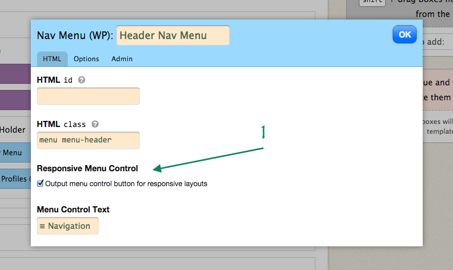
    I am so glad you are enjoying the Criss Cross skin. Currently your site is unavailable to view but my best thought for this would be to check if you have the “Responsive Menu Control” option selected for your WordPress menu.

    This option can be found on your skin Skin Editor page within your “Nav Menu Box”. The image below shows this option:

    Responsive Menu Option

    Hope this helps.

    #324

    nylacrystal
    Participant

    Thank you for the suggestion. I just went to look at that setting and the “Responsive Menu Control” option was checked off.

    I used my phone to check other websites made with Thesis/Criss Cross and the buttons do work, but not on my site.

    I just updated my WordPress to 4.0. but it doesn’t seem to have helped.

    Can you see my site now?

    Thanks,

    Nyla


    #346

    Thomas
    Keymaster

    Still putting up a 403 Permission Denied message when trying to view your website.

Viewing 4 posts - 1 through 4 (of 4 total)

You must be logged in to reply to this topic.